Improving our Storybook experience for Frontend Teams: Our Journey Towards a Streamlined Process
Learn how our frontend team streamlined and improved their Storybook experience by transitioning to a mostly automatic, plug-and-play process.


With the help of the effective frontend tool Storybook, you can test, document, and share isolated UI elements or pages with other team members. In this article, we'll explain how we created a single source of truth for UI, examples, and documentation by streamlining the story setup process, reducing boilerplate code, and utilizing Storybook's features. By doing this, we enhanced the developer experience and made it simpler for users to interact with our components, including designers and project managers.
In this article, we'll share our experience of how we streamlined and improved our Storybook process. We moved from a manual and complicated process to a mostly automatic and plug-and-play system, aiming to improve the developer experience and make it easier for other stakeholders like designers and project managers to interact with our components.
Setting Achievable Goals: Defining Our Objectives
One of our primary goals was to eliminate the need for manually defining ArgTypes for each prop of each component, which is time-consuming and prone to errors. Instead, we focused on automatically generating controls from the components themselves, preferably with TypeScript to avoid changing our stack. We also considered prop-types, a different type annotation system.
Additionally, we leveraged Storybook's features to create a single source of truth for UI, examples, and documentation. We simplified the process of setting up stories and reduced the boilerplate code and manual work required to create stories for our components.
Choosing the Right Tool for Your React Documentation: react-docgen vs. react-docgen-typescript
There are two major tools you may use to extract type definitions and examine the source code of your React components: react-docgen and react-docgen-typescript. A Storybook developer named Michael Shilman recently compared these technologies and discussed their benefits and drawbacks.
The choice ultimately came down to a speed vs. feature trade-off. More capabilities are available with react-docgen-typescript, however, it runs much slower than react-docgen. On the other hand, react-docgen is quicker than react-docgen-typescript, but it needs propTypes to be declared for each component.
Shilman advises utilizing react-docgen-typescript for the time being, therefore we used both programs to evaluate the outcomes and explore our options. Read on to discover more about how we use these technologies.
Getting Started: A Beginner's Guide to Improve Your Storybook experience
We will need a component to work with to begin. For our purposes, we'll use a straightforward button component along with various test objects. Remember that this example is merely a way to explore the possibilities and may not accurately represent a real-world event.
1import { HTMLProps, ReactNode } from 'react';
2import { ifProp, switchProp } from 'styled-tools';
3import styled, { css } from 'styled-components';
4
5export interface ButtonProps extends Pick<HTMLProps<HTMLButtonElement>, 'onClick' | 'className'> {
6  children: ReactNode;
7  /**
8   * The color theme of the button
9   */
10  colorTheme?: 'primary' | 'secondary' | 'neutral';
11  /**
12   * Wether or not the button can be interacted with
13   */
14  disabled?: boolean;
15  /**
16   * Wether or not the button occupies the full width of its parent
17   */
18  isFullWidth?: boolean;
19  /**
20   * Show a spinner
21   */
22  isLoading?: boolean;
23  /**
24   * Reverse the display order
25   */
26  isReversed?: boolean;
27  /**
28   * The size of the button
29   */
30  size?: 'large' | 'medium' | 'small';
31  /**
32   * The variant style of the button
33   */
34  variant?: 'blank' | 'fill' | 'outline';
35}
36
37const Wrapper = styled.button<ButtonProps>`
38  (styling is left as an exercise for the reader)
39`;
40
41export const Button = (props: ButtonProps) => {
42  const { children, isLoading, ...rest } = props;
43
44  return (
45    <Wrapper
46      {...rest}
47      isLoading={isLoading}
48    >
49      {children}
50
51      <span>{isLoading && '(...)'}</span>
52    </Wrapper>
53  );
54};
55
56Button.defaultProps = {
57  colorTheme: 'primary',
58  size: 'medium',
59  variant: 'fill'
60} satisfies Partial<ButtonProps>;
We've incorporated some basic properties and comment blocks that Storybook can recognize in our component to address a variety of use scenarios. It's important to keep in mind that even while some of these props are optional for use externally, the component still needs to define them. Let's now examine how our component appears when it is configured using the suggested TypeScript configuration from the Storybook docs.
1// .storybook/main.js
2
3module.exports = {
4  //...
5  typescript: {
6    check: false,
7    checkOptions: {},
8    reactDocgen: 'react-docgen-typescript',
9    reactDocgenTypescriptOptions: {
10      shouldExtractLiteralValuesFromEnum: true,
11      propFilter: (prop) => (prop.parent ? !/node_modules/.test(prop.parent.fileName) : true),
12    },
13  },
14};
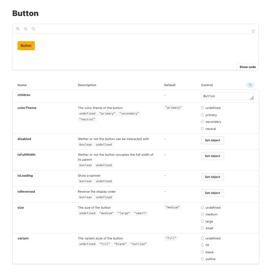
Unfortunately, there are a few glitches with our existing setup that need to be fixed. For instance, including an undefined element in the numerous option props can lead to unneeded clutter and misunderstanding. Furthermore, although the "default" column can be deduced, the controls lack a default value. And to make matters worse, boolean props are being treated like objects.
Let's look at react-docgen's handling of this scenario to investigate a potential alternative. By changing the reactDocgen setting in the Storybook configuration and specifying the component properties using prop-types rather than TypeScript, we can easily make the conversion.
1module.exports = {
2  //...
3  typescript: {
4    //...
5    reactDocgen: 'react-docgen',
6  },
7};
8// components/button.tsx
9
10//...
11
12// We would also need to move the description comments here
13Button.propTypes = {
14  children: PropTypes.node,
15  colorTheme: PropTypes.oneOf(['primary', 'secondary', 'neutral']),
16  disabled: PropTypes.bool,
17  isFullWidth: PropTypes.bool,
18  isLoading: PropTypes.bool,
19  isReversed: PropTypes.bool,
20  size: PropTypes.oneOf(['large', 'medium', 'small']),
21  variant: PropTypes.oneOf(['blank', 'fill', 'outline']),
22};
23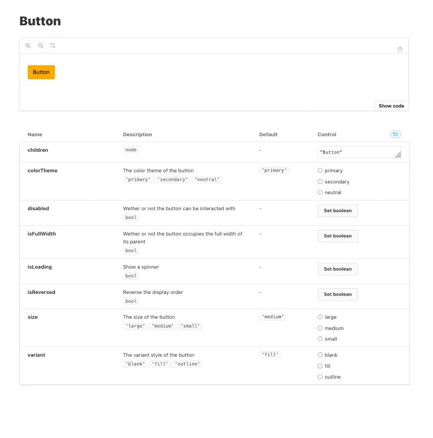
React-docgen comes considerably closer to fulfilling our needs right out of the box. The component's default values can be simply added to the story's arguments using the spread operator, even though default values are still lacking.
This is a quick and simple technique to guarantee that the essential values are included because we are already importing the component in the story specification.
1import { ComponentStory, ComponentMeta } from '@storybook/react';
2import { Button as ButtonComponent } from '../components/button';
3
4export default {
5  component: ButtonComponent,
6} as ComponentMeta<typeof ButtonComponent>;
7
8export const Button: ComponentStory<typeof ButtonComponent> = args => <ButtonComponent {...args} />;
9
10Button.args = {
11  ...ButtonComponent.defaultProps, // setting the default values automatically
12  children: 'Button'
13};
Let's continue our investigation into react-docgen-typescript as, as was previously said, we prefer to use TypeScript whenever possible.
The undefined choices that are clogging up our output must be removed as our next task. Props always have an internal value, even though they are officially undefined.
Fortunately, after reading react-docgen-typescript's documentation, we found a suitable solution to this problem. Several other choices are worthwhile looking into for more complicated props. We only need to edit the Storybook set up to put this technique into practice and here’s the result:
1// .storybook/main.js
2
3module.exports = {
4  //...
5  typescript: {
6    //...
7    reactDocgenTypescriptOptions: {
8      //...
9      shouldRemoveUndefinedFromOptional: true
10    },
11  },
12};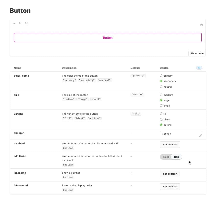
The problems we had previously have been resolved with a great deal of progress. The clutter brought on by undefined choices has been removed, and the issue of boolean props being mistaken for objects has been resolved. The "Set boolean" button on the boolean properties now transforms into a toggle when pressed.
This can be strengthened by giving each boolean prop a default value in the component or story. Additionally, if a prop is entered as a string and has the word "color" in its name, it is automatically recognized as a color control. We can now easily handle our most typical use situations.
Wrapping Up: Choosing the Right Tool for Your React Components
Our experiment produced pleasing outcomes. Previously consisting of hundreds of lines, the story file for our component is now only 13 lines long. With the help of this method, we can update the component and add new features without worrying about updating the story.
Most significantly, the generated documentation is prepared with ease and is clear and simple to understand. It is simple to picture how the procedure might be simplified once the next component was included.
Until next time!
Make sure to follow us on our social channels so you can keep up-to-date with our activities, and make sure you tune in to the Substack frequently so you can continue reading everything we create!
If you have read enough, and feel like you want to work with us and develop your product with our team, we would love to hear from you.
Want to know more, get in touch!
Other articles
Let's grab a (virtual) cup of coffee.
It's on us. Schedule your free consultation and let's talk about how we can help you.
No matter the challenge,
Untile rises to it.
No matter the problem,
Untile has the solution.
We transform businesses. We transform processes. We transform ideas.
