
Cofidis
How we rebuilt Cofidis’s credit simulator
Challenges
Humanize Cofidis website, improve credit simulator experience and mobile conversion.
Services
User experience and user interface design, front-end development and integration with client’s back-end.
Outcomes
Better brand awareness and more conversions on mobile with less rejection.
Cofidis is a reference in personal loans that manages up to 500 thosands accounts
Cofidis has been working on the Portuguese credit market since 1996. They are a reference in the credit to individuals segment, and they manage up to 500 thousand single accounts at any given time. They make it a point to provide a personalised and highly professional management experience to every single client they have, and their slogan reflects that: “De pessoas para pessoas” means “from people to people”.
They were having a little trouble with the automatised software solution they ran on their website. It should help prospective clients run a simulation on their own to see if the service was right for them, but a lot of interested people were quitting on it.
That’s where we came in.
Customers were having a hard time finding the right credit categories
Cofidis reported to us that people were finding their website, but once they actually started working on the simulation, they were frequently abandoning it halfway through.
It was necessary to understand why, and how to fix it.
That was not it, however. They needed a site that would significantly improve the entire experience for their users and customers. They wanted something with impeccable Ui and Ux, on browsers, tablets and phones. The site needed to reflect their values, the experience should be humane, simple, fluid.
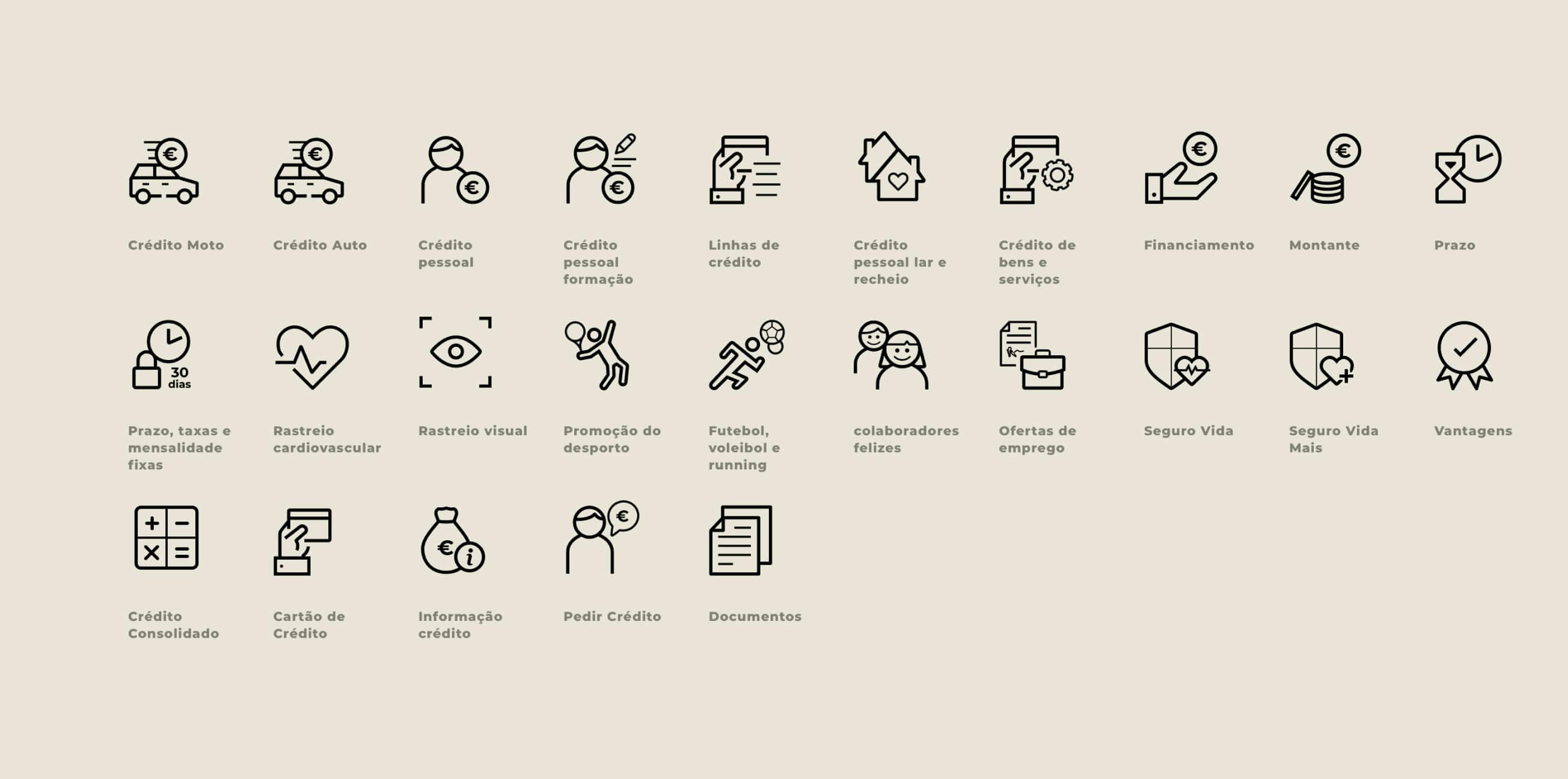
Here are some of the criteria our team received:
Readability
Strictly financial terms should be kept to a minimum.
Cross-platform
The site should be equally functional on all platforms.
Integration
External teams should have easy access.
Business goal
From a business point of view, of course, the site had a specific goal: increase actual product requests. This was not only a design challenge, but also a functionality issue.
Why were customers quitting after initiating the process?
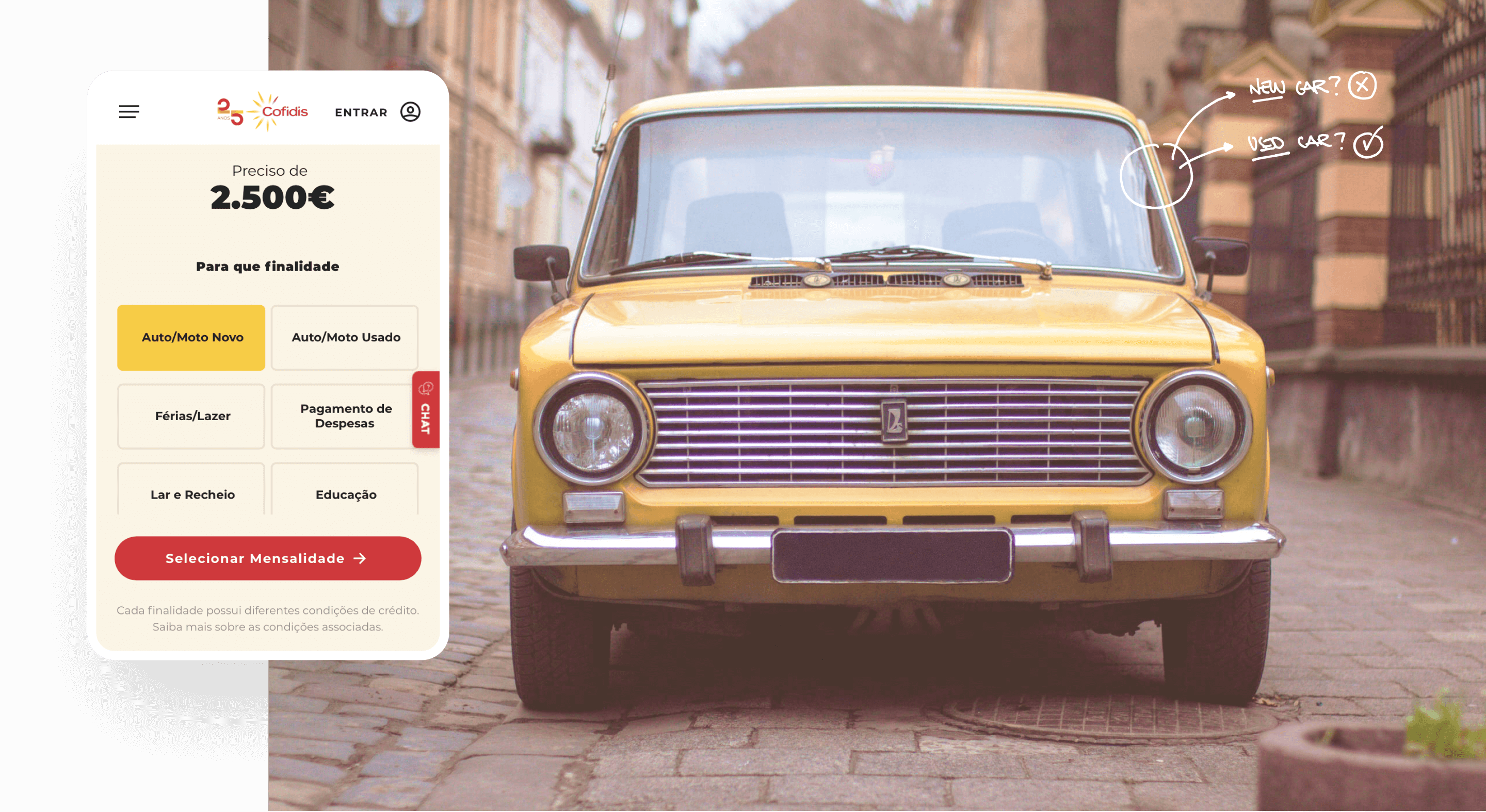
We realised that customers were selecting whatever credit they felt had the most attractive conditions in terms of values and/or fees. It wasn’t clear that not all credits were applicable to all situations, so people just picked whatever looked best.
Once it became clear that they had to start over, they didn’t.
This was especially true on mobile.
It had to be fixed.
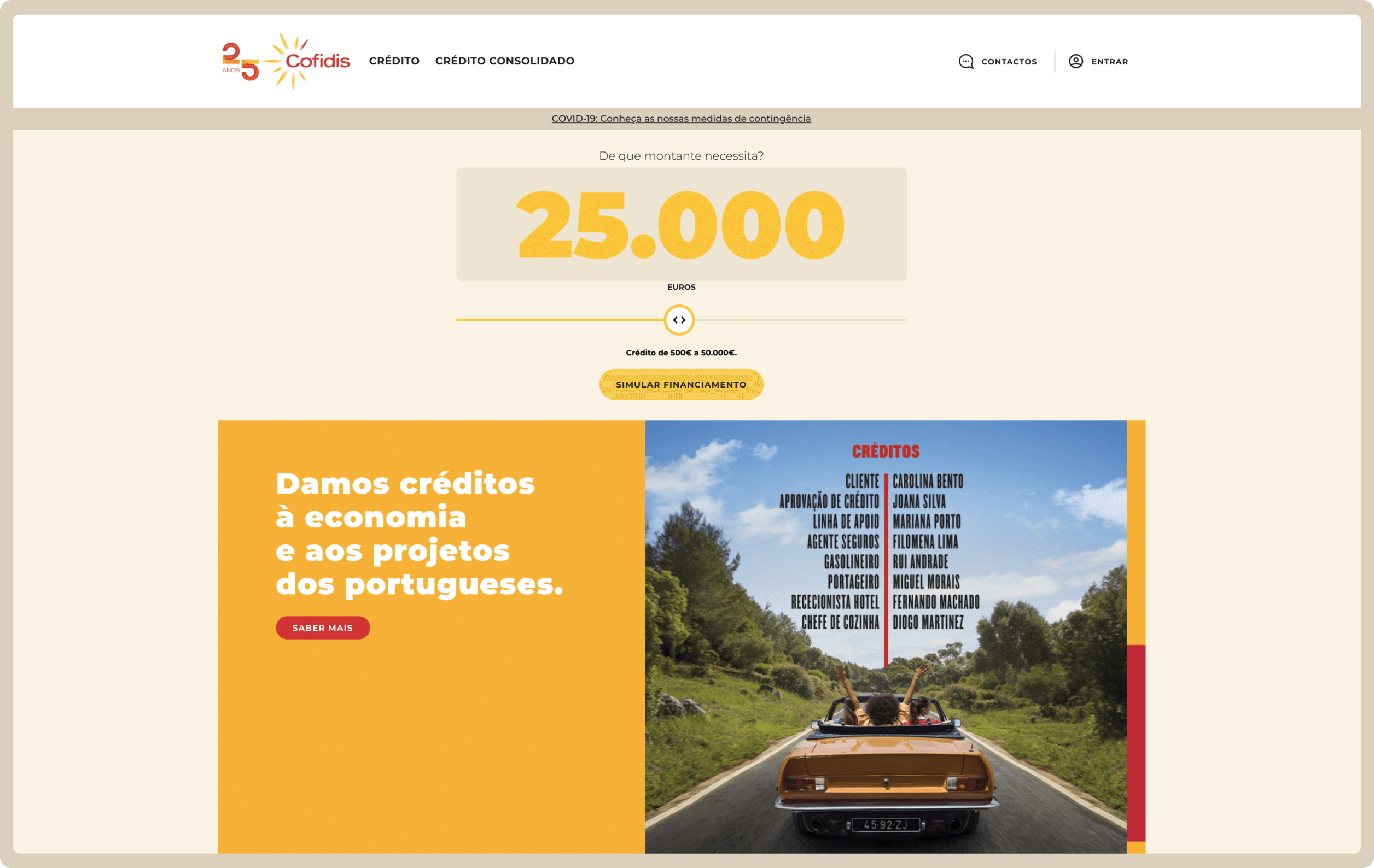
The solution, part 1
Creating a brand new simulator
This was our main priority, but we always had to keep a few other things in mind, such as:
- The site needed to work perfectly on tablets and mobile;
- We had to obey the criteria and specifications of the Banco de Portugal, Portugal’s financial regulator, including simulating their validation of all processes.
- We needed to build the site in blocks so it would be easily manageable by a third party;
This last part presented a bit of a challenge, because every block had different functionalities (banner, simulator, text, buttons, etc.) but it was entirely worth it. It allowed for much greater flexibility and dynamism for the website.
It’s also important to note that every part of the development process was in keeping with Untile’s U-framework method, which means that extensive testing and iterating was done on each step to ensure that the final product had no mistakes.
The solution, part 1.1
Workshopping the specifics
There were two roadblocks for our work to be successful, so a lot of time was dedicated to figuring out exactly what we were building so the result was right.
The first issue was that we were using technologies that were brand new to the team (we used a bunch of different techs to achieve the perfect site, including Vue.js, TypeSscript and Sass). Nothing the team couldn’t handle, but it did mean putting in a few more hours.
Second was Cofidis’s very specific demands. The client knew exactly what they wanted, and our team would stop at nothing to deliver. There were a number of aesthetic and functional aspects that weren’t directly related to the final output that had to be implemented before we could call the job done.
After we understood all of that, we needed to know every single thing about the original forms. What worked about them, and what didn’t. Where it was that people got confused and made the wrong choice, and at what point did they quit.
The solution, part 1.2
Building a foolproof simulator
After we had every morsel of information available to us, we started building. We managed to reutilise some code from a previous team, which did save us some time an helped us quickly improve our knowledge of the brand new technologies we were using.
We wanted to make the user’s experience as simple as possible.
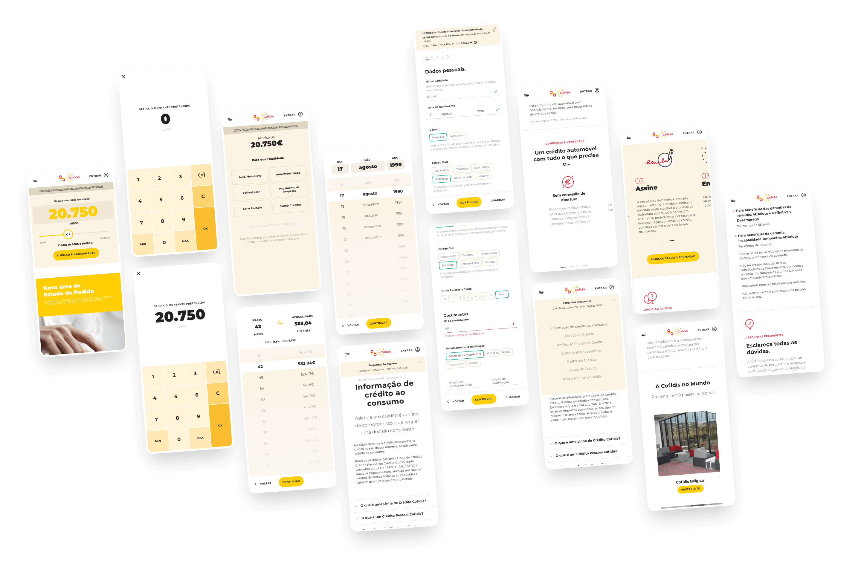
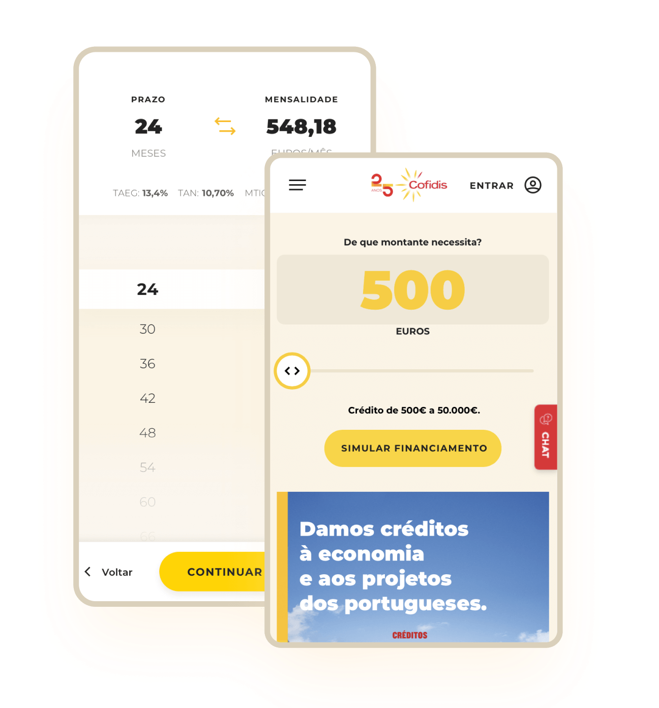
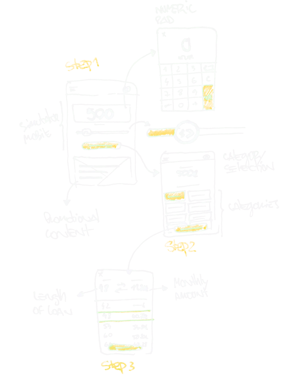
We decided that the first step would be to create an independent system for the mobile version of the website. We based it on a numpad, so the user could input the value themselves in a simple interaction.
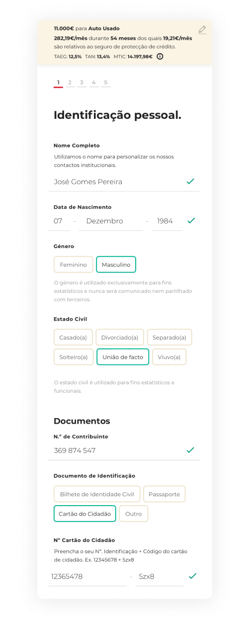
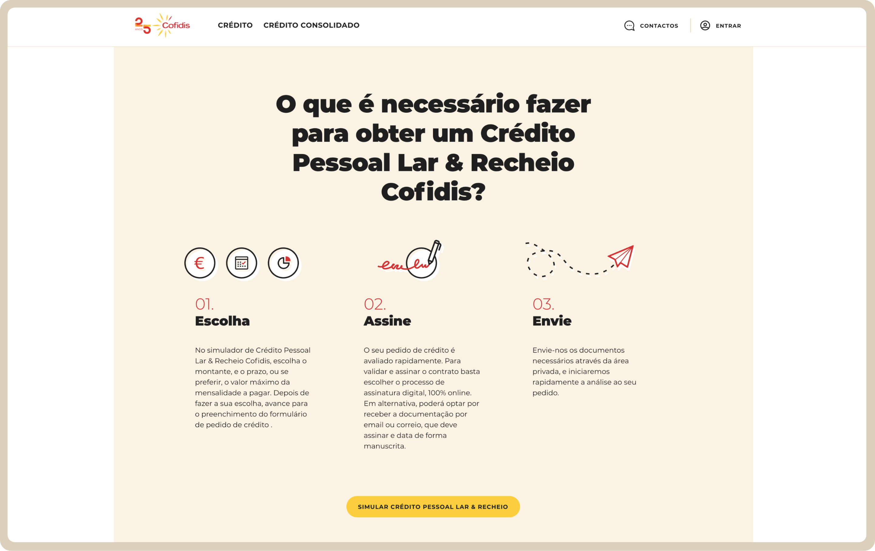
The next decision we made was to have the user pick the kind of credit they were applying for immediately. This is now the first step. By doing this, the results of the simulation are to the right category from the get-go. No possibility of mistakes.
The solution, part 1.3
Ensuring the simulator follows a personal approach
- We turned the results of the simulator into a textual summary of the data accrued during the simulation, so the user can relate better with the interface and values presented;
- We hit every pain point we could find in the forms themselves, transforming every process into a more intuitive and simple version;
- We created groups of content to select both the information and what the user should be focusing on;
- We broke the simulation into steps, to facilitate progress and reduce the cognitive load of every given moment.
A fast, dynamic and attractive website
For Untile, it has a massive technical learning experience
The development team got the chance to test and implement technologies we quite simply had never worked with before. Directly or indirectly, that knowledge has been serving the team ever since.
We also gained great knowledge and experience with financial regulations and credit simulations. Every one of those forms was created and broken down from scratch by the team. We had to figure out how to make things work from the customer’s perspective, and in order to make something as simple as possible, you need to understand it deeply.
We are now better prepared to face any challenges in this specific sector.
We are looking forward to doing so.
Let's grab a (virtual) cup of coffee.
It's on us. Schedule your free consultation and let's talk about how we can help you.
No matter the challenge,
Untile rises to it.
No matter the problem,
Untile has the solution.
We transform businesses. We transform processes. We transform ideas.
